There are recessions and there are soft landings. And once in a blue moon, you may even come across a perfect landing. So perfect, in fact, that it justifies the exuberant behaviour arguably displayed by most asset classes today. This month we do our best to try to explain this. The only problem is, we don’t believe in Nirvana.
Is the market really priced for perfection?
I am starting to question the market’s wisdom. Back in the mid 1980s, when I arrived in London still wet behind the ears, my then mentor taught me never to ignore the signs the market is throwing at you. The market is always right, he reminded me more frequently than I care to remember. Always!
I never forgot those words, and they have quite frankly served me well over the years. How can you ignore the collective wisdom of thousands of investors? How can you possibly think you know better than everyone else? Or so I thought until recently. But I am starting to doubt. Here is what is causing me some serious headaches. When it comes to gathering intelligence on the market, I am probably no different from anyone else. There are indicators which can do nothing wrong in my little invisible book and there are indicators which I couldn’t care less about. The problem arises when the indicators you trust, and which have served you well for years, start to deliver conflicting signals.
Recession indicators: the inverted yield curve
Let’s start with the yield curve. An inverted yield curve (i.e. short term interest rates being higher than long term rates) has long been a pretty foolproof indicator of recession, at least in the Anglo-Saxon world. It is considered gospel in some circles and I have to admit to paying close attention to the shape of it. Right now, the U.S. yield curve is modestly inverted from 3 months to 10 years, following the path of the U.K. curve which has been flattish for years. Now, if you go back to the Absolute Return Letter from March of this year, you will find an essay named “The Forecasting Powers of the Yield Curve”. In there, we argued that the yield curve has been “tinkered with” by structural factors, thereby reshaping the curve and reducing its predictive powers in the process. Whether this is true or not, the fact of the matter is that the U.K. yield curve has done a poor job in terms of predicting the behaviour of the U.K. economy over the past couple of years.
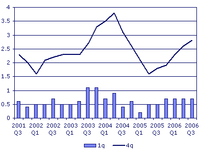
Chart 1: U.K. GDP Growth.
Source: www.statistics.gov.ukwww.statistics.gov.uk
As you can see from chart 1 above, the U.K. economy lost considerable momentum in 2004 and early 2005, without actually tumbling into recession, only to recover nicely in late 2005. A classic case of a soft landing. Today, with the growth rate enjoying unprecedented stability, nobody talks about recession on the horizon for the U.K. economy despite the ongoing inversion of the U.K. yield curve. So it is possible for the yield curve to invert without the economy automatically falling through the cracks.
Across the pond, it is not only the yield curve predicting problems on the horizon. In Duke University’s latest CFO survey, a full one-third of Chief Financial Officers of the largest U.S. companies predict a recession to begin during the next 12 months. That is the highest level of pessimism since the last recession to hit the U.S. economy 5-6 years ago. Interestingly, only 20% of the CFOs asked are more optimistic about the overall economy than they were 3 months ago, whereas 46% are more optimistic about their own company’s prospects. This is a strong indication that much of the bad news having hit the U.S. economy in recent times has not filtered through to the companies yet. In other words – expect more earnings disappointments in the next few quarters.
Recession indicators: unit labour costs
Let’s move on to another topic close to my heart. Unit labour costs. I always believed unit labour costs told an important story. I was brought up to believe in that. During my years at Goldman Sachs, it almost became religion. Keep unit labour costs under control and you keep inflation in check, so we were told.
Now, with labour costs rising more rapidly again in many countries, and productivity enhancement not being nearly powerful enough to offset the increase, unit labour costs are starting to form some serious clouds on the investment horizon. In the U.K. private sector, average pay rises of 4-5% now appear to be the norm. The U.S. is not far behind; neither is continental Europe.
What bothers me is that many of these people who told us, year in year out, that all we had to worry about was unit labour costs (I am exaggerating only a tiny bit for effect), now argue that unit labour cost is a flawed concept. They say that it is a low quality measure and cannot be relied upon. Instead they all clap their greasy hands in excitement over falling oil prices and say that the worst of the inflation problem is now behind us with crude trading $20 below its peak earlier this year.
Technically, I guess they are correct. Headline inflation is indeed falling like a stone out of the sky. But that is not the point. The more interesting point is what will happen to inflation once the temporary effect of falling crude prices is washed out. Will rising unit labour costs drive core inflation higher? Will the Fed start to focus on headline inflation now that it is opportune to do so? Will the ECB abstain from further rate hikes now that the headline number they always chose to focus on is better behaved?
What does the contradictory behaviour of asset classes mean?
Furthermore, we find the contradicting behaviour of many asset classes even more disturbing. To begin with, look at the record high level of interest for U.S. bonds as portrayed in chart 2 below. Demand for bonds is usually strong when investors expect soft economic conditions, perhaps even recession. Given the recent spike in demand, one would expect the general consensus to favour a very soft economy. Otherwise chart 2 does not make much sense.
Chart 2: Record Interest in U.S. Bonds
Source: CFTC, Morgan Stanley.
At the same time, though, riskier asset classes such as emerging market equities, high yielding currencies and commodities (other than energy products) have also performed very well recently. All these asset classes are usually “products of good times”. In other words, they require strong economic conditions to outperform. So where is the logic? How can defensive and aggressive asset classes perform well simultaneously? One possible explanation of this odd behaviour may be found in chart 3 below. The chart shows what most of us know already, namely that volatility in financial markets has dropped precipitously in recent years. However, the implications of this drop may not be quite so clear to everyone.
Chart 3: Global Volatility Indices
Source: Bank for International Settlements
As Bill Gross points out in his November Investment Outlook (see www.pimco.com), lower volatility leads to overconfidence amongst investors which results in lower and lower risk spreads and more and more financial leverage. Ultimately, and contrary to common belief, low volatility can therefore lead to financial and economic instability.
This line of thinking goes hand in hand with the irrational (exuberant?) behaviour of many asset classes recently. Unless you believe in perfect landings (not just the ‘soft’ variety), it is inconceivable that all asset classes can continue their first class journey to financial Nirvana. To us it is more La-La Land than Nirvana anyway.
By Niels C. Jensen, chief executive partner at Absolute Return Partners LLP. To contact Niels, email: njensen@arpllp.com