A couple of weeks ago, I looked at the history of Asian stock markets. This article is essentially part two of that, so you may want to read the original article first if you haven’t already. But in short, I looked at some very long-term charts. And my conclusion was that, while at first they might suggest that Asia is entering a bubble, once you examine the context, it clearly isn’t.
I got a number of follow-up questions about inflation, average returns and using logarithmic charts. So they’re going to be the main topic of this article.
What a logarithm can tell us
First off, a number of you asked me what the Asian market charts looked like on a logarithmic scale. For anyone who isn’t familiar with the maths, let me explain briefly. A logarithm of a number is the power to which a base must be raised to give that number. For example, the base 10 logarithm of 1,000 is three, because 1,000=10^3.
- the history of Asian stock markets
- Three ways to invest in the Asian consumer
Why is this relevant? Because if you take logarithms of a series of numbers, the results alter your original series to one that is proportional. For example, 100 is 10 times 10, while 1,000 is 10 times 100. So the ratios 100/10 and 1000/100 are the same (10).
The gaps between them on a normal scale are very different – 90 and 900 respectively. However, take logarithms and the pattern is different. For example, the base ten logarithm of 10 is one, that of 100 is two and that of 1000 is three (as we saw above).
So numbers that had the same ratio to each other in the original series, have the same absolute difference between them. In this case, the gap is one.
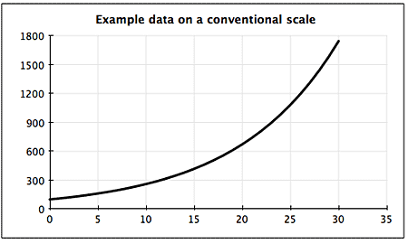
To see why this is helpful, look at the example below. In a market context, a trend like this looks like a building bubble at first glance. The chart seems to be accelerating towards the end.
But it’s not. In fact, this example is growing at a constant rate of 10%. If we plot it using logarithms rather than the original series, we can see that. The rapidly growing bubble turns into a far less alarming straight line.
So what happens when we look at some of the Asian markets on a logarithmic scale? It puts the size of some of these moves into perspective. We can also see the details of what happened in the early years, which are swamped by the scale on a conventional chart.
Generally, the markets fall into two groups. Take somewhere like Singapore: it doesn’t look like much of a bubble anyway, and any suggestion of it vanishes on a logarithmic scale. There are ups and downs, but generally progress is steady.
On the other hand, if we take Indonesia, the logarithms help to make the recent big jump less alarming. But as you can see on the lower chart, there’s still a clear acceleration in the index from 2003 to present. It had flatlined for many years before that.
Logarithmic charts are very useful for putting long-term markets into perspective. But even after doing so, emerging markets still tend to show big swings reflecting events in the local economy, rather than steady progress.
The impact of inflation
As I mentioned last time, inflation can have a big impact. Emerging markets tend to have higher inflation than developed ones. This is especially relevant in the case of Indonesia. The country has always tended to have high inflation, and suffered a bout of hyperinflation after the Asia crisis. Since equities are more-or-less real assets (i.e. ones that should reflect the effects of inflation over time) this will push up the level of the stock market without translating into real gains for investors.
Expert tips & advice for investing in Asia! Claim your FREE guides from MoneyWeek that include:
- How to go about investing to Asia
- Which brokers to use to buy foreign shares
In fact, the effects of inflation are among the most striking things when we look at long-term stock market returns. Another is how variable returns have been. The chart below shows long-term real and nominal returns from 17 developed stockmarkets over the last 110 years. Note that this is on a total return basis (i.e. including the effects of receiving and reinvesting dividends).
Equities beat inflation over the very long run in every market. They also invariably beat local bonds, although only just in some cases. But you can also see that inflation took a sizeable chunk out of returns in many countries. Overall, the average real return has been about 5% a year.
Unfortunately, there isn’t anything comparable for emerging markets. Many markets aren’t very old. And for those that are, historical data is sketchy. But I crunched what data I have on Asia to try to come up with an idea of typical returns.
Note that the time frames involved are much shorter. And this is price return data (i.e. just based on the change in the index, rather than dividends). Also, these numbers cover just the benchmark index for each market, which in some cases might not be a perfect reflection of the whole market. And the inflation data could be sketchy. But it’s the best I’ve been able to do for now.
Focusing on Indonesia again, you can see the impact of hyperinflation and crisis. Nominal returns were over 13% a year. But strip out inflation and that drops to just over 2%. Yet Asia’s two leading basket cases – Thailand and the Philippines – still managed to trail in behind, which shows what a disaster their political classes have made of running those countries.
However, the fact that this is price return rather than total return makes the comparisons flawed. Over the very long term, the impact of reinvested dividends swamps simple price changes. Since the 1870s, dividends have accounted for around 80% of cumulative gains on the US market. Even over a decade or so, they probably account for around half of gains in most developed markets.
Emerging market dividend payout ratios tend to be lower than in developed markets, so I wouldn’t expect the effect to be so pronounced here. The long-term dividend data isn’t readily available for most of emerging Asia to do full calculations (I’m always trying to gather more, so if any of you find a source for any market, please let me know).
But I suspect that looking at total returns might well add a couple of percentage points to returns in markets such as India. It could possibly double returns in longer established markets such as Hong Kong, Malaysia and Singapore.
Of course, all this is backward looking. It doesn’t predict the future. But it is useful for us to put the possibilities in context. History suggests that even if we avoid disastrous economies – the equivalent of Belgium and Italy on our developed world chart – we’ll do fairly well to get a total return after inflation of around 8-10% a year from the broad market.
However on the plus side, as overseas investors, we should also benefit from rising currencies. We can also try to structure our portfolios to avoid companies and sectors that are likely to destroy value. That will mean higher returns for us – something that I’ll be discussing in the future.
• This article is from MoneyWeek Asia, a FREE weekly email of investment ideas and news every Monday from MoneyWeek magazine, covering the world’s fastest-developing and most exciting region. Sign up to MoneyWeek Asia here