Looking back on 2010, there’s one simple idea that just about sums it up. And it could well be the key for making money in 2011 too.
The simple idea that has served investors well is ‘interest rates down, everything else up’.
Low rates have almost single-handedly delivered wonderful returns across the board from stocks and bonds through to commodities. It even kept property from a precipitous fall. And that’s exactly what the central banks wanted.
2010 sets the scene for 2011
It’s clear that the central banks want to keep rates down. That’s because they want to keep assets up. They’re happy to give the banks free money to speculate, so long as it drives up prices and keeps confidence up.
So if you want to make serious money in 2011, you’re going to have to do the same as in 2010. That is hold your nose, ignore the stink, and put your money down.
Just be aware that there’s a massive caveat to all this. The whole thing works in reverse too: ‘interest rates up, everything else down’.
So if rates get forced up, you can expect the markets to stall and even reverse. For 2011 it’s absolutely paramount that we keep a beady eye on interest rates.
And here’s the interesting thing. In the US (and that’s where it matters) interest rates have started to move upwards. If that continues, it’s going to have massive implications for your investments.
Now, you won’t have seen Ben Bernanke hiking rates – on the contrary, he wants them pegged to the floor. When I say rates are moving up, I’m talking about market interest rates – and we can see that story unfold in the bond markets.
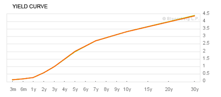
The most important chart for 2011
The ‘yield curve’ maps out interest rates for bonds across different maturities. Every City trader keeps a very close eye on it. And it’s going to be especially important this year. In fact, I really recommend you add the yield curve to your ‘watch-list’ (I’ll show you how to do that below).
Here’s the US Treasury bond yield curve:
Source: Bloomberg
An upward sloping yield curve is pretty normal and basically shows that long maturity bonds (which won’t be redeemed for 30 years) demand a higher interest payment than short-term lending. It also shows that investors are expecting today’s artificially low rates to be short-lived.
The yield curve shifts around on a daily basis as the price of bonds change. What’s of interest at the moment is that at the long end (15 to 30 year bond maturities) rates are starting to rise. And that’s exactly what the Fed doesn’t want to see.
Basically investors are saying they want to be paid more interest for the risk of holding US debt. This is important. Because as we know – ‘rates up, means everything else down!’
Watch out if short term rates start to rise too
We’ve already heard the warning shots from the Bank of England. Paul Fisher, the executive director of markets and a member of the rate-setting Monetary Policy Committee (MPC), said the Bank is looking to increase rates tenfold from their current low of 0.5%.
On top of that we’ve seen long-term rates rising in the States. So the story to follow in 2011 is rising rates…
The FT publishes data and a chart for the UK yield curve – you can find it here. Here’s the latest picture:
For the next six months it tells us to expect rates to stay at 0.5%, but then the market expects them to take off. But this is nothing to worry about – it’s already priced in to the market…
What I’m looking out for is a major shift in this curve. Specifically, a shift upwards implies market interest rates are going up. If that happens, watch out… financial assets could suffer badly.
With rates so low, even a 1% shift in the curve is a massive change. That will be a signal that the financial world as we know it is about to change.
Stay in for more gains in 2011
For the moment, my advice is to continue to ride the bull market, but take care. I’m staying defensive on stocks and I’ll keep you updated as the year unfolds. I’m also continuing to play the commodities rally. Who knows how long this Fed-induced rally will continue? When the music is playing, you keep on dancing.
Just make sure you put the yield curve on your watch-list. I think it’s the most important chart for investing in 2011.
• This article was first published in the free investment email The Right side. Sign up to The Right Side here.
Your capital is at risk when you invest in shares – you can lose some or all of your money, so never risk more than you can afford to lose. Always seek personal advice if you are unsure about the suitability of any investment. Past performance and forecasts are not reliable indicators of future results. Commissions, fees and other charges can reduce returns from investments. Profits from share dealing are a form of income and subject to taxation. Tax treatment depends on individual circumstances and may be subject to change in the future. Please note that there will be no follow up to recommendations in The Right Side.
Managing Editor: Frank Hemsley. The Right Side is issued by MoneyWeek Ltd. MoneyWeek Ltd is authorised and regulated by the Financial Services Authority. FSA No 509798.
https://www.fsa.gov.uk/register/home.do