“A tsunami alert has just sounded for US stocks,” says Dominic Picarda in the Financial Times. For only the ninth time in 83 years, a signal called the “killer wave” has hit the S&P 500 chart. This omen, he says, has signalled an average fall of 40% over 20 months – nasty. So should you get out of stocks now?
The killer wave signal is derived from the Coppock curve. This is a charting tool, and like all charting tools, it’s based on a simple premise: that the past is usually a reliable guide to the future. If certain patterns in charts of market prices have worked well as ‘buy’ or ‘sell’ signals in the past, then you should watch out for them in the future so you can buy or sell ahead of the crowd. There are many charting indicators around, but on this occasion, it’s the work of Mr Edwin SC Coppock – published in 1962 in Barron’s under the title The Madness of Crowds – that’s getting all the attention.
Introducing Coppock
“Crowds do too much too soon,” wrote Coppock. That’s because “they are motivated by emotion rather than reason”. So at times they will dump stocks whether or not the economic fundamentals warrant it. At other times they will buy and force prices up.
So Coppock and his team at Trendex Research Group (which provided services for brokers and investment bankers) set out to come up with a practical tool that would signal what the investing herd was about to do next. His eureka moment was to consult the Episcopalian Church on how long people tended to take to adjust to severe bad news: illness, bereavement, divorce or unemployment. As Coppock put it, these are “the greatest stresses we have to cope with”. He was told by the church bishops that it took between 11 and 14 months for an average person to recover. This became the inspiration for Coppock’s charting indicator.
How his system works
Coppock’s hunch was that investors would take a similar length of time to recover their confidence after a market downturn. The exact maths is a bit fiddly, but in short, notes Peter Temple at iii.co.uk, Coppock used the bishops’ answer to convert stockmarket data into “a ten-month weighted average (more recent months carry more weight than those further back) of the percentage difference between the market index now, versus where it was 11 and 14 months ago”. If the resulting single figure – read each month – is below zero, the market is still in “mourning” and should be avoided. But when it rises continuously that period is over and investors are feeling more confident – time to buy.
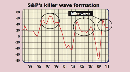
According to Investors Chronicle, it can also be read the other way around. The initial sell signal, says Picarda, “occurred last summer, followed by a buy signal this spring and now a further sell signal” (see chart above). The chart has revealed what chartists call a “head and shoulders” with the right (most recent sell signal) shoulder featuring a lower high and a lower low than last summer’s left shoulder formation. What does that mean? In short, it’s not pretty.
Killer waves of this type were “sighted in the early stages of the crash of 1929, the panic of 1974, the dotcom bust and the recent credit crunch collapse”, notes Picarda. Worse, this isn’t just an alarm signal for the S&P 500, it is also “worrying for the Dow Jones Industrial Average, whose correlation with the S&P is almost one for one”.
The flaws in the theory
It all seems pretty compelling. But before you pick up the phone and scream “sell”, be aware of a few pitfalls. For a start, Coppock didn’t originally design his system to identify selling points, just buys – it has been modified for this purpose. And while it has proved reliable on a number of occasions, it doesn’t always work. The problem – as ever – is timing. As Tom Stevenson notes in The Daily Telegraph, during the 1929-1932 stockmarket crash, the negative indicator might have been sighted (had it existed back then), but the next positive reading would have “dragged investors into the worst suckers’ rally of them all”. It would also have put investors back into the stockmarket too early after the dotcom crash – around November 2001.
And agreeing precisely where chart patterns start and end is a fraught business. Jason Goepfert of Sentiment Traders has done his own Coppock study. He found that, “when we look at the next 20 months, the maximum decline in the S&P 500 was a median 13.9%”, while the “maximum gain” was “quite a bit higher”. He also reckons that the last six killer wave signals “led to quite bullish outcomes” (excepting one from November 2007).
Another problem with applying Coppock to today’s market is he could never have foreseen today’s conditions – central banks are pumping in unprecedented amounts of liquidity to markets everywhere. As Stevenson notes, Coppock might be useful “if this [was] a severe but ultimately run-of-the-mill recession”, but it’s anything but. So there are lots of reasons to worry about stocks, but as Goepfert concludes, relying solely on Coppock to make that call might be a mistake.