Where will the FTSE 100 be at the end of 2013? If you read the papers at all over the next month, you’ll see a dozen different answers to this question. And they’ll all either be wrong or lucky – forecasting the market over such a short period is a mug’s game, and most of us know it. But is there any way to predict returns reliably over the longer term?
Can returns be predicted at all?
Since 1926, annual American stockmarket returns, adjusted for inflation, have ranged from around -5% to 20%, on a rolling ten-year basis. That’s a huge gap in performance. Clearly, if you’d been able to invest ahead of a 20%-a-year period rather than a -5% one, it would make a big difference to your retirement portfolio. So finding any sort of tool (or metric) that could help you pick the right time to buy would be extremely useful. And that’s what Vanguard Asset Management tried to find in a recent study.
The metrics Vanguard looked at are all ones “investors would know ahead of time”. So there are no measurements you could only use with the benefit of hindsight. To measure the effectiveness of each, Vanguard looked at the ‘R2 correlation’. This is a snapshot of the extent to which one variable (say, historic earnings growth) is linked to another (subsequent stockmarket performance).
The conclusion? On the one hand, “many commonly cited signals have had very weak and erratic correlations with actual subsequent returns, even at long investment horizons”. On the other, the good news is that a few numbers are reasonably reliable over the longer term.
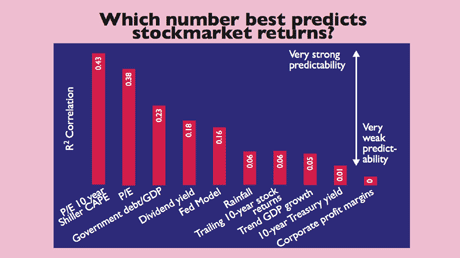
These measures don’t work
Vanguard looked at a huge range of predictors (you can see most in the chart below). One metric with little predictive value is ‘trailing values for dividend yields’. The idea is that when yields are high, it signals that share valuations are cheap (since the yield is just the dividend payout over the latest share price). And if shares are cheap, a rally is likely.
This sounds sensible, but is in fact of little use in forecasting medium or long-term returns. The same can be said of corporate profit margins. When margins are high, so the argument goes, it means firms are near their maximum profitability for the currency cycle, so stocks must be peaking (or vice versa when margins are low). But again the correlation is weak.
Past returns don’t predict the future either (as advertisements on financial products remind us). Nor do economic growth rates (as MoneyWeek readers will be fed up with being told by now). Nor does the oft-quoted ‘Fed model’, which looks at the gap between the earnings yield on stocks (in effect, the price/earnings ratio flipped on its head) and the ten-year Treasury yield.
The top three crystal balls
So what does work? There are three top predictors (see graph). First, the cyclically adjusted price/earnings ratio (also known as the Cape, or the Shiller p/e, after Yale professor Robert Shiller who popularised the idea). This compares share prices to average earnings over ten years, the idea being that you ‘smooth out’ ups and downs in the business cycle. Second is the plain old p/e ratio (which uses one year of earnings). And interestingly enough, the third-best predictor of future returns is the ratio of government debt to GDP.
It is worth realising that even these have their limits, however. The Cape is a Moneyweek favourite, but even here you need to be careful. The R2 is only 0.43 and even then only on a ten-year view, not a single-year view.
In plain English, that means that even the Shiller p/e, which comes out top as a predictive tool, is only reliable around 43% of the time, and only then over medium-to-long term horizons. It seems it is a reasonably good predictor of when markets may start to revert back to their long-term average, having strayed above or below it, but not of exactly when this will happen.
In third place is the ratio of government debt to GDP. This is a little bit like a homeowner comparing their mortgage debt to their annual salary to decide how much money they’ll have available to spend after Christmas. Ideally, you want the ratio to be small. But watch how you interpret this one.
As Vanguard notes, “although its R2 makes it seem a better performer than others, the reason is actually opposite to what one would expect”. That’s because the more indebted the government, the higher subsequent stockmarket returns have turned out to be. As Vanguard says, “we would not expect such a correlation to persist” because debt should normally act as a drag (via higher taxes or lower public investment) on a productive economy and therefore its stockmarket.
Rather than try to solve the conundrum, Vanguard suggests investors simply realise that trying to pull conclusions about fast-moving stockmarkets over short-time horizons from “slow-moving” economic data isn’t easy, or wise. Also, it’s worth bearing in mind that this data only covers America – a similar lesson won’t necessarily apply in other nations.
What this means for investors
The Vanguard study just confirms our fondness for the Cape measure. The US is currently on the expensive side, on a Cape of around 21 compared to a long-term average of 16. But Europe looks like a happier hunting ground.
In particular, as we’ve mentioned in the past, Italy looks good value on a Cape of just over seven (according to Mebane Faber’s blog, World Beta). You can buy Italy via the iShares FTSE MIB (LSE: IMIB) exchange-traded fund.