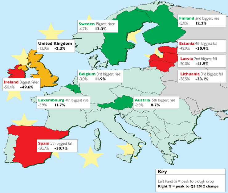
This map shows the five biggest residential property market risers (in green) and fallers (in red), plus Britain measured from the start of 2007 to the third quarter of 2012.
The data were drawn from the Eurostat EU house-price index. The first percentage shows the peak to trough price drop and the second percentage, the peak to Q3 2012 price change, on which the rankings above are based.